Friday, August 17, 2007

Design LOGO

When I studied LOGO in Content course, I practiced for music company of following owners - Wessley, Tossley and Jowes. The process is made by asking the creative question for making logo, the theme of company and their goals. We found that the compination of their name will create the name of company WESLEY. The main theme of company is music for hot pop star so that we used star and disc as relating music star and the color are orange for the increasing, raising , becomming hot . Text is used color suitable with the color theme. We made star and disc mixed together to compose the corporation, relation of music, pop star and company. These are following logos which I made for example under three types.


Sunday, August 12, 2007

Mockup

There are the mockup which created for website . Designed by Hung, Chung.


Self Portrait

It's not easy to make a self-portrait in the way people can look and see how you are.
Therefore, I tried to practice with some one’s portrait before I made my ^_^.
The following 2 images are my practicing:


Look at this girl, she is graceful and looked natural. The water background and textile bring a peaceful feeling to the audience. For me, she makes think about mothers.

Here is the second practice: she is now looked mysterious, and modern because of the light lines.

The next images are my self-portrait, just look and feel how am I.


Thursday, August 2, 2007

Typography

There are three typography design. Each typography represented different emotion , different sense.

With Flying , I try creating it keep the high-faulting feeling of viewers.


With Collapse as its definition is to fall together suddenly ... as the reason why I make each letter of collapse is standing, lying, slanting ... the viewers' feeling is same as taking unreliable things.


With arising as its meaning, I designed it as the rising up of nature from small, weak to big, huge and strong ... so I chose the level of green for arising.

Tuesday, July 31, 2007

Saturday, July 28, 2007

The rythm of life

when you saw this pic at the first time, it was characterless ... but at the second ... the third ... there are some feeling were found out ... lighting, profound, smooth and luxury ... this pic was taken suddently the light in the street ... this pic created vaporous things and the warmth.

Mockup website

This is our group's mockup of website in DIM 3. We design tis mockup in Photoshop. We try to design the themeplate related with the style of the logo. This is website of "Saigon Players", the logo has the bammbo and funny - sad face and palm-leaf conical hat so that we choose the themeplate belonged Vietnam culture. The main color as the color of old bamboo and the navigation bar is the body of the bamboo. Moreover in each subpage we also choose the vietnam style to decorate.


Lord of Rings logo


It was a good practice to remake “THE LORD OF THE RINGS” logo. I tried to identify the font of the logo, and then I found that there is a font very similar to the logo. That was “Hightower” font. Unfortunately, my computer does not have that font, so I used “Imprint MT Shadow” font, which could be similar for the font of TLOTR logo.
Here is my result.

Friday, July 20, 2007

Vietnam Today


After the discussion about Collage and Photomontage in the class, I would do a little practice about this technology by developing an idea about “Vietnam Today”.
First, the little girl in the center could be represented for my country today: poor and small. A few pictures with blur effect create the growth of Vietnam but what you can see in the pictures is not really good about this country.
Second, the way I use color for the poster has some meaning. If we say Vietnam is growing, the haft left could represent the past and the right side is now to future. In the past, Vietnam was mostly an agricultural country, nature, and true color. However, today part is only one color. Why is that?
Let us just think about Vietnam today… air polluted, people and bikes are everywhere. It does not fresh anymore, and becoming boring.

Jan Lenica


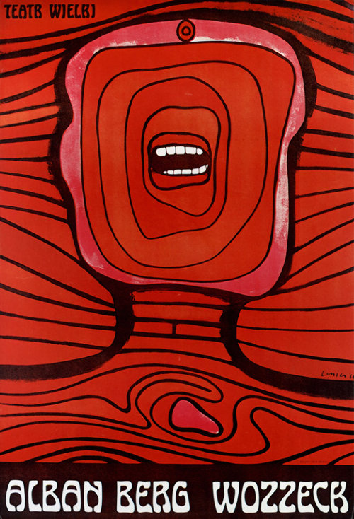
I have viewed a graphic designer named Jan Lenica in the Polish Poster website who has a very special type in her posters.
Just take a quick look around her posters; we could see that she preferred human face and human body in many of her posters. The human face and body are very abstract. They do not look real; sometimes there was only a mouth or just the eyes on the face.
On the other hand, I realize that Jan likes to use dark colours combine with thick line to create the motion for her posters. Some of Jan’s posters are strong contrast and the elements often symmetric.