


I have viewed a graphic designer named Jan Lenica in the Polish Poster website who has a very special type in her posters.
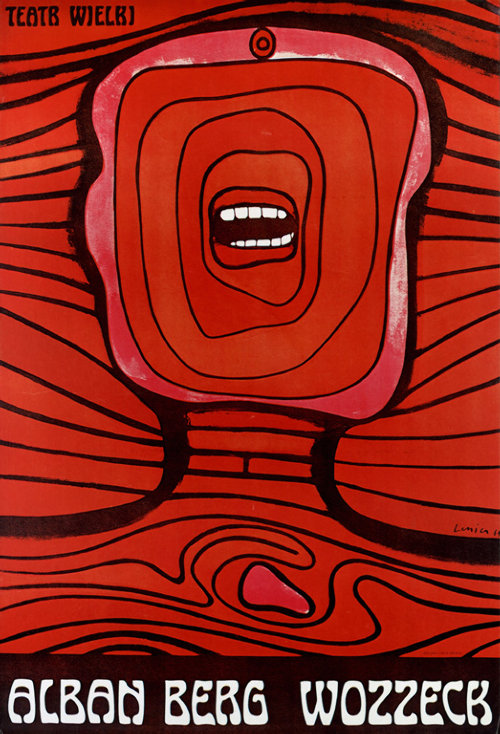
Just take a quick look around her posters; we could see that she preferred human face and human body in many of her posters. The human face and body are very abstract. They do not look real; sometimes there was only a mouth or just the eyes on the face.
On the other hand, I realize that Jan likes to use dark colours combine with thick line to create the motion for her posters. Some of Jan’s posters are strong contrast and the elements often symmetric.
Friday, July 20, 2007
Jan Lenica
Subscribe to:
Post Comments (Atom)

No comments:
Post a Comment