
After the discussion about Collage and Photomontage in the class, I would do a little practice about this technology by developing an idea about “Vietnam Today”.
First, the little girl in the center could be represented for my country today: poor and small. A few pictures with blur effect create the growth of Vietnam but what you can see in the pictures is not really good about this country.
Second, the way I use color for the poster has some meaning. If we say Vietnam is growing, the haft left could represent the past and the right side is now to future. In the past, Vietnam was mostly an agricultural country, nature, and true color. However, today part is only one color. Why is that?
Let us just think about Vietnam today… air polluted, people and bikes are everywhere. It does not fresh anymore, and becoming boring.
Friday, July 20, 2007
Vietnam Today


Jan Lenica


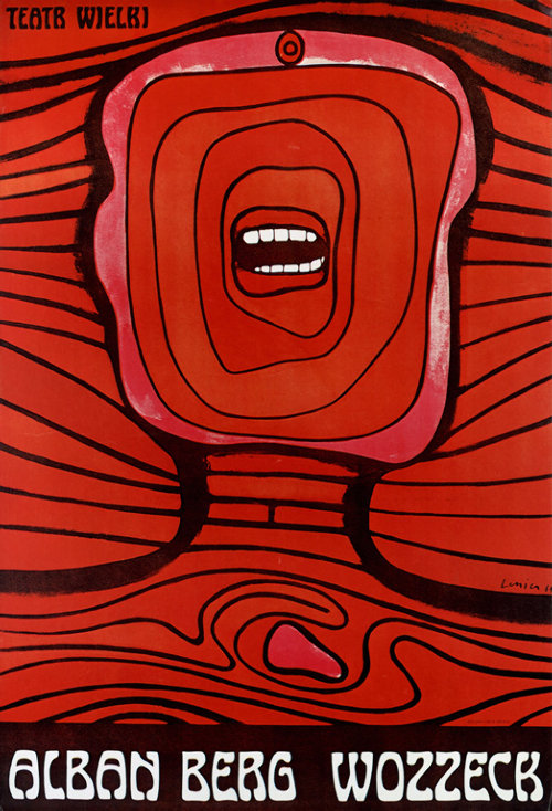
I have viewed a graphic designer named Jan Lenica in the Polish Poster website who has a very special type in her posters.
Just take a quick look around her posters; we could see that she preferred human face and human body in many of her posters. The human face and body are very abstract. They do not look real; sometimes there was only a mouth or just the eyes on the face.
On the other hand, I realize that Jan likes to use dark colours combine with thick line to create the motion for her posters. Some of Jan’s posters are strong contrast and the elements often symmetric.
Sunday, May 6, 2007
Stamp Art
What is a stamp art? Is it simply a crafting processing of different materials on a plate panel? Yes it is. However, the expression or the idea should be concerned as an important part. A stamp art sometimes creates an impression due to its unique layout-expression.
Commonly, a stamp art is developed on a plate, which could be made from glass, wood, thick paper, plastic, or steel. Then the artists express their idea on it by using different materials such as pieces of paper, color ink, and anything which is suitable for the expression.
Rubber stamp art by Michael Dare:

This is a rubber stamp art, which creates a beautiful painting in colors. The shapes are complicated but together they make a nice balance.
Charm Box:

You can make your own unique box's lid by crafting your favourite materials on to the lid
Christmas Card_00295:

This Christmas card was developed with stamp art। Grid layout also is popular in stamp art। Is this a kind of module grid?
Triangle Collage:

Once again I wonder is this a deconstructed grid layout or module grid layout with triangle shapes? However, the color expression is really impressive!
Thursday, May 3, 2007
Century Gothic - a nice font
Century Gothic is a kind of font, which is based on the geometric style sans serif faces. It was designed in 1991 for Monotype Imagine-a typesetting and typeface design company. It takes stimulation from Sol Hess's Twentieth Century, which was a successful Futura typeface in 1937-1947.
Century Gothic has a larger x-height, and more stroke width. the face is totally full circle counter for its lowercase ‘o’, ‘q’, ‘a’, and ‘g’.
This typeface is useful for headlines and display in small quantities of texts, particularly in advertising. Gothic is the word related to something very natural. Therefore the Century Gothic typeface could be suit for the cases, which express the beautiful feeling, natural feeling, and perfect feeling. However, due to its layout based on the sans serif, it should be use for modern printing.
The following links are more detail about this typeface:
http://en.wikipedia.org/wiki/Century_Gothic
http://www.fonts.com/findfonts/detail.htm?pid=205644
The public welfare poster

Friday, April 20, 2007
Easy way to embed you Flash file to your blog!
First, you need to upload your .swf file on any host in the internet. This step makes sure that your .swf file is always available to access. For me, I used my unix host of RMIT unix sever to store my file.
Then, apply the followings codes into your blog:
<OBJECT classid="clsid:D27CDB6E-AE6D-11cf-96B8-444553540000"codebase="http://download.macromedia.com/pub/shockwave/cabs/flash/swflash.cab#version=6,0,0,0" WIDTH="320" HEIGHT="240" id="Yourfilename" ALIGN="">
<PARAM NAME=movie VALUE="Yourfilename.swf"> <PARAM NAME=quality VALUE=high> <PARAM NAME=bgcolor VALUE=#333399> <EMBED src="Yourfilename.swf" quality=high bgcolor=#333399 WIDTH="320" HEIGHT="240" NAME="Yourfilename" ALIGN="" TYPE="application/x-shockwave-flash" PLUGINSPAGE="http://www.macromedia.com/go/getflashplayer"></EMBED></OBJECT>
Finally, replace "Yourfilename" by the real link of your .swf file (after upload your file on a host, you will receive a link to download your file). Your Flash movie will be already displayed on your blog. ^^
You also can change the width and the height of display window. Have fun!
If you want to learn more about this, please visit this site http://animation.about.com/od/flashanimationtutorials/qt/embedswfwebpage.htm
Thursday, April 19, 2007
Camera Moves
The clip below is from Final Fantasy VII – Advent Children. You can see some “Extreme Close-up” moves of camera in the beginning, which focus to the main characters. There are also some dramatic angle shots, which are very impressive.
Wednesday, April 11, 2007
Photomontage

I have an assignment in class called “Photomontage Assignment”. Therefore, I think it is good to preview this site before I start to work. In general, photomontage is some thing like this image. By using different kinds of image, we can create a whole picture, which consists a new meaning. According to the article, it’s better if we use our own photographs and images. Just take the camera, go out, and shoot as many as we can. Then a last thing we need to do is using Photoshop to build our new face.
^.^
Visit this site to read the article and get the tutorial if you like.
http://www.computerarts.co.uk/tutorials/2d__and__photoshop/photomontage_tricks.
Tuesday, April 3, 2007
Typography_Listen to the voice

Choosing a font for a layout is very important. It depends on the tone of the layout. Fonts also have their voice. For example, in these two layouts, the word “REMEMBER” is used to create the meaning of them. A happy font type presents the word “Remember” in the pink layout, which is an inorganic font. The characters look like flowers. Do you think so? ^^
In the second layout, the font type is organic. Its voice leads you to something very old and mystery. Combine the typography and the image (man in black), the layout would talking about some things in a detective novel
Business Card_Orchidarium

Making a business card could be simple & not really simple, do u think so?
In this case, I consider about the white space of the layout. Using a part of the Orchid image on the top right will make a big impress to the audiences, then it would connect the audiences to the company name "Ochidarium".
At the bottem side, there are information of the company owner. The name and the phone nubers of this person actually are a little bit bigger than other information. This would lead the audiences easier to get what exactly information they need.
All at once, I'd to leave the white space to make the layout cleaner, fresher, and the easier information catching.
